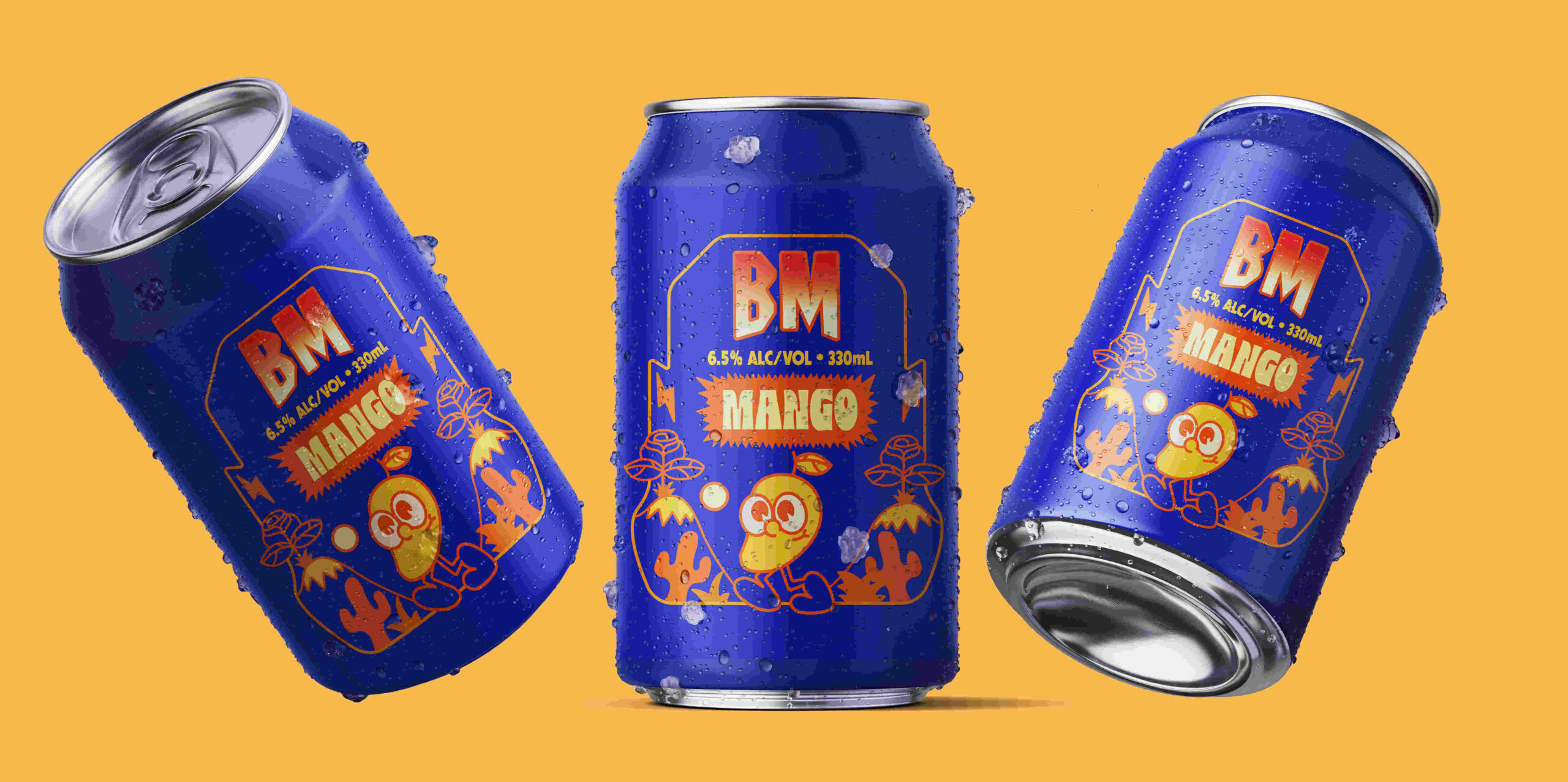
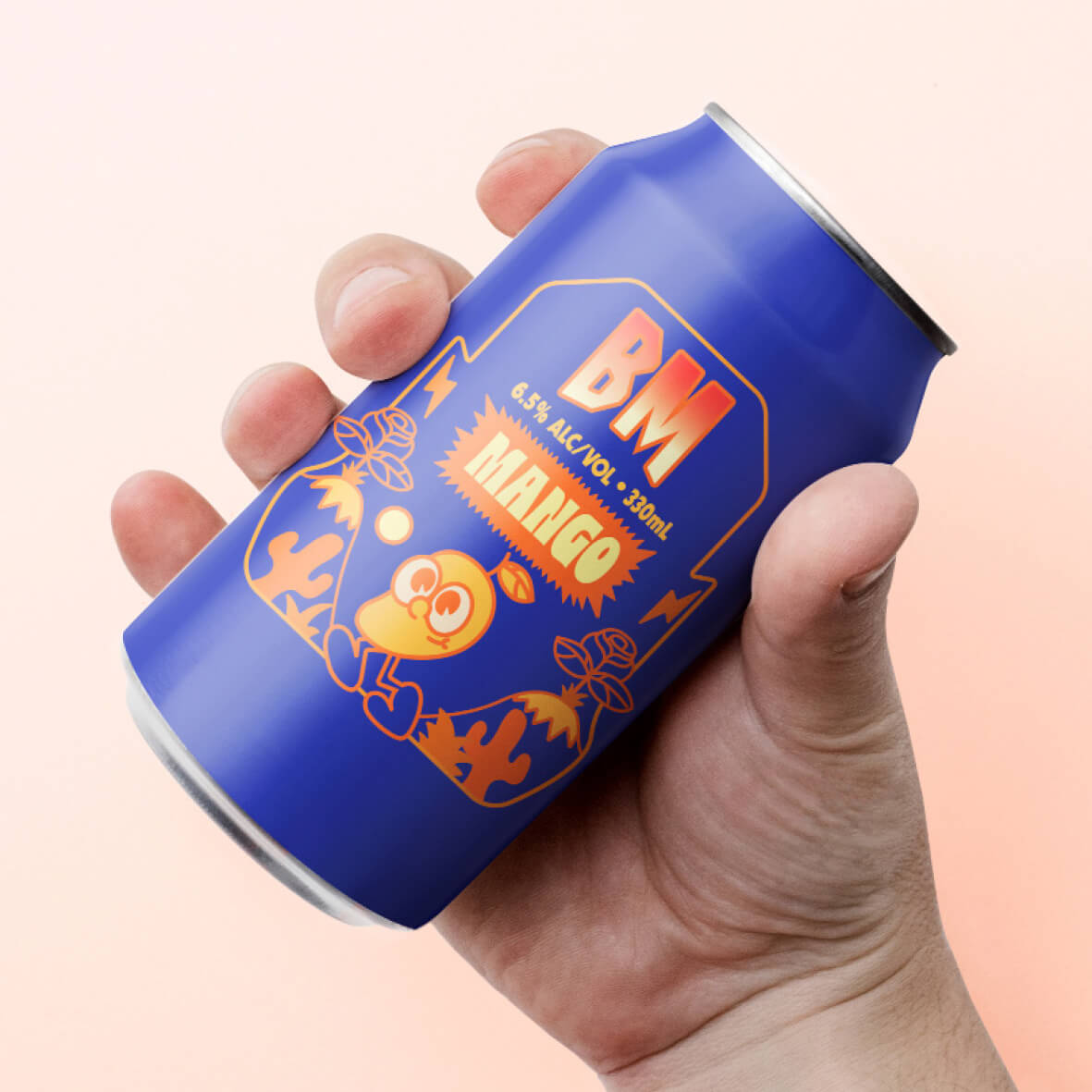
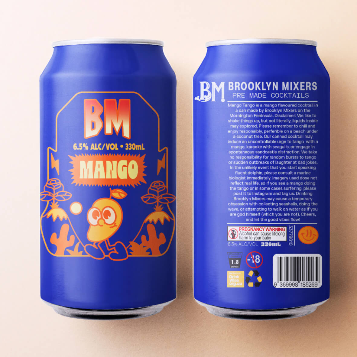
With a natural interest in the alcohol industry due to the commercial opportunities, I chose to focus on cocktails as a market segment, as I was fascinated by the stereotype created by marketing campaigns that targeted women as the main consumer of cocktails. I wanted to challenge this stereotype, and after conducting my own market research, I discovered that men didn’t want to order cocktails because of the more feminine colours used in the marketing and packaging of cocktails. My message focused on encouraging males to opt for a cocktail instead of beer or wine, by creating a more inclusive cocktail product with broader appeal. I designed graphics for a can (which hides the colour of the beverage) in a darker base palette with heavier and bolder typefaces which created a more masculine design. I designed this product to appeal to both men and women, which broadens the market for this product and contributes towards breaking down stereotypes.
*Please note, freedom provided in the design brief allowed the use of characters, in the real world this is not appropriate.